

ABSTRACT
For the project, I examined the charting of sunspot numbers comparing the usual visualizations of line charts which because of the compressed nature of the x-axis don’t clearly show any cyclical activity except for the well-known 11-year solar cycle. Radial charts, conversely, are well suited to expose other cyclical data. By visualizing individual years, using sunspot number data from the National Solar Observatory between 1945-2017 (1), radial visualizations of sunspot numbers appear to show an underlying cycle.
1 INTRODUCTION
Historical records from China document the first sighting of sunspots in about 800 B.C. (3)(4) Sporadic measurements and observations of sunspots continued as court astrologers in China and Korea believed the blemishes on the Sun foretold of important events. Theophrastus, an ancient Greek scholar who was a student of Plato and Aristotle, mentioned sunspots around 300 B.C. John Worchester, an English monk, made the first drawing of sunspots in December 1128.
While Italian astronomer Galileo Galilei(5) is generally credited for first viewing sunspots in 1610, English mathematician Thomas Harriot also observed sunspots with a telescope. Their observations were unknown to each other. Johannes Fabricius(2) was the first to publish a treatise about sunspots in 1611.
Sunspots are dark areas of cooler gas within the photosphere of the Sun’s atmosphere. Sunspots are temporary phenomena lasting from just a few days to several months. They expand and contract as they move across the Sun’s surface. The phenomena are caused when magnetic fields inhibit the convection of hot gasses and plasma. Sunspots occur at any size but many of the largest could easily fit the Earth.
In the early 1800s, astronomers such as Heinrich Schwabe and Rudolf Wolf, found that sunspot numbers rose and fell periodically, in a cycle lasting about 11 years. This cycle also corresponded with an increase and decrease in geomagnetic storms on Earth offering the first hint that the Sun acted as a giant magnet. It was not until the work of George Ellery Hale in 1908 photographed the Zeeman effect, a method that can show the presence of a magnetic field, in a sunspot spectrum that added this fact to the field of solar astronomy.
2 THEORY
Sunspot numbers are calculated by summing the number of individual sunspots and ten times that number for groups. It is a general indication of the Sun’s activity. The counting of sunspots is still done by hand by viewers around the world. Two “official” sunspot numbers exist. One, the International Sunspot Number, is compiled by the Solar Influences Data Analysis Center in Belgium. The NOAA sunspot number is compiled by the US National Oceanic and Atmospheric Administration.
To show a possible cyclical frequency pattern to the data, I used a mathematical formula known as Fast Fourier Transform (FFT) to find the main cyclical frequency to the sunspot number data; presumably the 11-year solar cycle, and also to see if other, lesser, frequencies showed at different time periods in the data. (1)
2.1 Line Chart Visualization of Sunspot Numbers
The visualization of the daily sunspot numbers is generally shown as a line chart. The chart clearly shows the Sun’s 11-year cycle whether the period is just a few decades or a couple of centuries. The chart easily gives a viewer a feel for the regular drumbeat of the Sun’s rhythm.
To create these visualizations, I used D3.js. D3 is a popular javascript library for creating visualizations. The original idea was to create a interactive dashboard containing both radial and line chart elements. A slider allows the user to choose a year, configured within the extents of the dataset. Once a year is chosen, the data is filtered within that extent and displayed. I created a basic line chart to verify that the data was performing as expected. Since it showed the regular waxing and waning of the solar cycle, I moved on to displaying a radial chart.
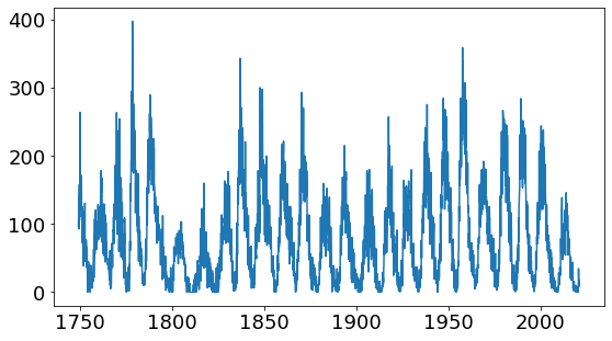
Figure 1: Sunspot numbers charted monthly between 1750 and 2010.
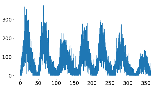
Figure 2: Sunspot numbers charted daily between 1945 and 2017.
2.2 Radial Chart Visualization of Sunspot Numbers
Radial charts are considered less effective in showing information and can skew perception (6)(7) but can be used to visually show readers cycles that might be lost in line chart or scatterplot data. The following charts produced using D3.js show individual years. They both appear to show cyclical rise and fall in the number of sunspots.
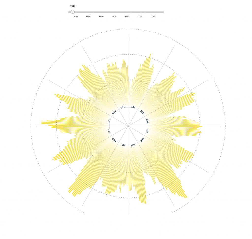
Figure 3: Sunspot numbers charted daily in 1945.
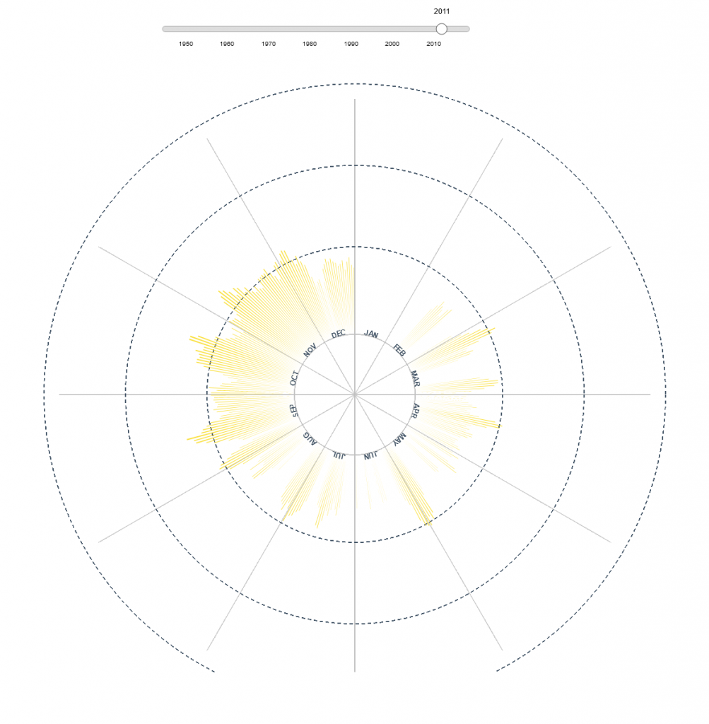
Figure 4: Sunspot numbers charted daily in 2011.
Getting the chart to display in a radial fashion was not difficult but controlling the chart using a slider was time consuming. The first step was to create a readable slider. D3.js comes with some slider properties but the resulting slider is very small and hard to use. It creates a bad user experience. Since D3 can be controlled via CSS, I added styles to enlarge the slider control and styled the slider itself. The data itself contains daily dates and sunspot numbers. I created a function using the parseDate functions to only deliver years so that could be displayed on the slider. One frustration might be that the slider seems continuous. And indeed it is, It is moving through all 365 days of the year. A better user experience would be if it “clicked” into place by year instead of relying on the days.
Once the slider was in place, I set about creating functions to update the chart with just the sunspot numbers of the year. That required some refactoring of code. And initial attempts resulted in nothing at first then I was able to move through the years but the elements stacked on top of each other. The elements were not clearing once drawn. This layering creates an interesting effect but is not very useful.
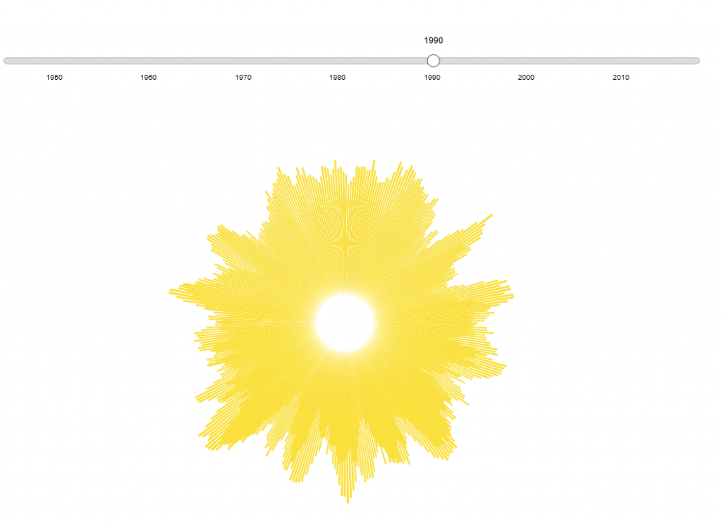
Figure 5: Elements stacked on top of one another in this iteration of the chart.
Stumbling across a design pattern relating to the enter(), update, and exit() functions helped greatly. In short, I created a initialize function that called an updateChart() function. A separate function filtered the data and was called on mouseover. The filtered data was sent to the updateChart function and the chart rendered. The breakthrough occurred when I added remove(element) at the beginning of the updateChart function. This essentially removes the chart element and is replaced a few lines later with updated chart data.
This is one reason why no data appears initially. I was unable to affect that change for the final artifact. I then added rings corresponding to the number of sunspots. Labelling those proved to be more difficult than expected. And borrowing some code from the D3 gallery, I was able to create spokes for the corresponding months and create the labels at the inner radius location.
Another deficiency is noticeable if you rollover the sunspot spokes. Making the spokes change to a red color for more inspection proved a simple CSS style change on mouseover. But getting a tooltip to show with the data of date and sunspot number did not work as expected. If you open the console, you can see that the correct data is outputting on mouseover. I just was unable to translate that visually.
3 USING THE FFT FORMULA TO FIND UNDERLYING CYCLES
Because a cycle appears to show in the radial chart, I wanted to know whether that cycle actually appears in the data. This has been a philosophical question since first casting the data into the radial chart. Using the Fast Fourier Transform algorithms in a python Jupyter notebook, I was able to explore the cyclical frequencies within the sunspot number data. When using the entire dataset, the 11-year solar cycle shows prominently. In the plotting another peak, showing a different cyclical frequency, appears at about 13 times per year. That translates into about every 28 days which closely matches the solar rotation.
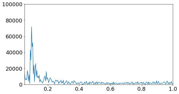
Figure 6: FFT plot in Jupyter notebooks showing frequency of 11-year solar cycle.
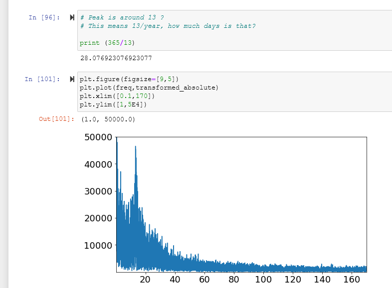
Figure 7: Similar FFT plot but taking closer look at the second cyclical frequency in sunspot number data. An event that takes place about 13 times a year or every 28 days. This closely matches with the Sun’s rotational period.
4 CONCLUSION
The radial chart does take a moment to load. More than 26,000 days are a part of the dataset. Also drawing the labels and ticks seems to take more time because of the cartesian geometry. I’m not sure if this can be improved.
The radial charting of sunspot numbers appears to the eye to have a regularity. By using the Fast Fourier Transformation algorithm, not only does the 11-year solar cycle show but also a shorter interval cycle closely tied to the solar rotation of 28 days. By showing the data in the radial chart format, in a single year, a pattern emerges that is not easily seen within the more traditional line chart.